We will begin with an example of how a normal Form.List can be implemented. The following code is taken from the Ant Design's Form.List Dynamic Form nest Items section.
import { MinusCircleOutlined, PlusOutlined } from "@ant-design/icons";
import { Button, Form, Input, Space } from "antd";
import React from "react";

const App: React.FC = () => {
  const onFinish = (values: any) => {
    console.log("Received values of form:", values);
  };

  return (
    <Form name="dynamic_form_nest_item" onFinish={onFinish} autoComplete="off">
      <Form.List name="users">
        {(fields, { add, remove }) => (
          <>
            {fields.map(({ key, name, ...restField }) => (
              <Space key={key} style={{ display: "flex", marginBottom: 8 }} align="baseline">
                <Form.Item {...restField} name={[name, "first"]} rules={[{ required: true, message: "Missing first name" }]}>
                  <Input placeholder="First Name" />
                </Form.Item>
                <Form.Item {...restField} name={[name, "last"]} rules={[{ required: true, message: "Missing last name" }]}>
                  <Input placeholder="Last Name" />
                </Form.Item>
                <MinusCircleOutlined onClick={() => remove(name)} />
              </Space>
            ))}
            <Form.Item>
              <Button type="dashed" onClick={() => add()} block icon={<PlusOutlined />}>
                Add field
              </Button>
            </Form.Item>
          </>
        )}
      </Form.List>
      <Form.Item>
        <Button type="primary" htmlType="submit">
          Submit
        </Button>
      </Form.Item>
    </Form>
  );
};

export default App;
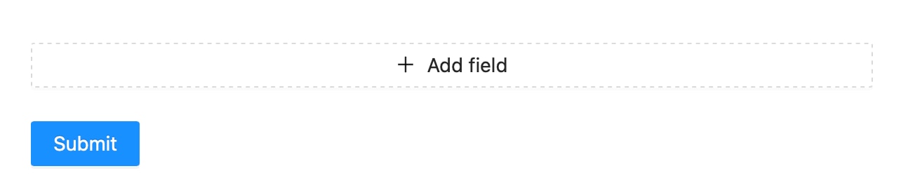
This has the normal functionality of adding new fields and removing existing ones. This is what the default UI would be like:

How to show error/warning when the field count exceeds a limit?
When using, the Form.List component, we cannot add the normal "rules" properties like "required", "message", etc to the component for validation. Instead, we need to pass a custom validator.
Let's say we need to limit the number of fields to a total of 5. In that case, our custom validator can be implemented as the following :
  validator: async (_, names) => {
                  if (names.length >= 6) {
                    return Promise.reject(new Error("Exceeded maximum rubric field. (Max is 7)"));
                  }
                },
We need to pass this custom validator to the "rules" prop as a property. The full implementation is as follows:
import { MinusCircleOutlined, PlusOutlined } from "@ant-design/icons";
import { Button, Form, Input, Space } from "antd";
import React from "react";

const App: React.FC = () => {
  const onFinish = (values: any) => {
    console.log("Received values of form:", values);
  };

  return (
    <Form name="dynamic_form_nest_item" onFinish={onFinish} autoComplete="off">
      <Form.List
            name="option_details"
            rules={[
              {
                validator: async (_, names) => {
                  if (names.length >= 6) {
                    return Promise.reject(new Error("Exceeded maximum rubric field. (Max is 7)"));
                  }
                },
              },
            ]}
          >
        {(fields, { add, remove }, { errors }) => (
          <>
            {fields.map(({ key, name, ...restField }) => (
              <Space key={key} style={{ display: "flex", marginBottom: 8 }} align="baseline">
                <Form.Item {...restField} name={[name, "first"]} rules={[{ required: true, message: "Missing first name" }]}>
                  <Input placeholder="First Name" />
                </Form.Item>a
                <Form.Item {...restField} name={[name, "last"]} rules={[{ required: true, message: "Missing last name" }]}>
                  <Input placeholder="Last Name" />
                </Form.Item>
                <MinusCircleOutlined onClick={() => remove(name)} />
              </Space>
            ))}
            <Form.Item>
              <Button type="dashed" onClick={() => add()} block icon={<PlusOutlined />}>
                Add field
              </Button>
            </Form.Item>
            <Form.ErrorList errors={errors} />
          </>
        )}
      </Form.List>
      <Form.Item>
        <Button type="primary" htmlType="submit">
          Submit
        </Button>
      </Form.Item>
    </Form>
  );
};

export default App;

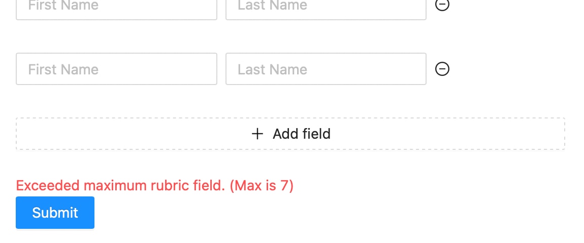
Whenever the field count exceeds 5, an error will be triggered with the message we provided in the custom validator. This will also restrict the form from submitting just like normal validation.
How to set a minimum number of fields by default in the Form.List?
In order to have a specific set of fields initialized by default, we need to pass in the field values to "initialValue" prop of the Form.List component. Check the following article to learn more about it