Let's begin with an example of how you normally build a Form.List in Ant Design. The following code is for a base Form.List with some random input names:
import { MinusCircleOutlined, PlusOutlined } from "@ant-design/icons";
import { Button, Form, Input, Space } from "antd";
import React from "react";

const App: React.FC = () => {
  const onFinish = (values: any) => {
    console.log("Received values of form:", values);
  };

  return (
    <Form name="dynamic_form_nest_item" onFinish={onFinish} autoComplete="off">
      <Form.List name="users">
        {(fields, { add, remove }) => (
          <>
            {fields.map(({ key, name, ...restField }) => (
              <Space key={key} style={{ display: "flex", marginBottom: 8 }} align="baseline">
                <Form.Item {...restField} name={[name, "first"]} rules={[{ required: true, message: "Missing first name" }]}>
                  <Input placeholder="First Name" />
                </Form.Item>
                <Form.Item {...restField} name={[name, "last"]} rules={[{ required: true, message: "Missing last name" }]}>
                  <Input placeholder="Last Name" />
                </Form.Item>
                <MinusCircleOutlined onClick={() => remove(name)} />
              </Space>
            ))}
            <Form.Item>
              <Button type="dashed" onClick={() => add()} block icon={<PlusOutlined />}>
                Add field
              </Button>
            </Form.Item>
          </>
        )}
      </Form.List>
      <Form.Item>
        <Button type="primary" htmlType="submit">
          Submit
        </Button>
      </Form.Item>
    </Form>
  );
};

export default App;
This example is taken as a reference from the Ant Design's Form.List Dynamic Form nest Items section. The above code will render the basic UI as shown below:


We can add new fields by clicking on the "Add Field" button.
How to have a minimum number of fields visible by default in Form.List?
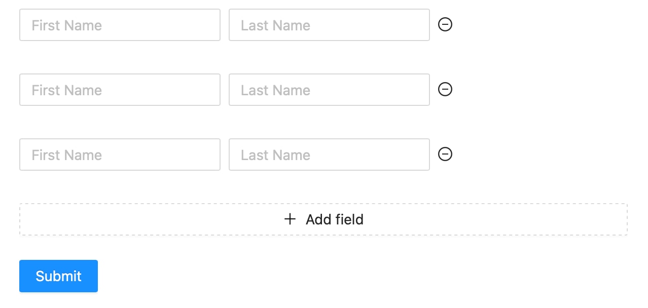
What I want is 3 fields visible by default. For this, we have to pass a prop called "initialValue" to the Form.List element. See the following code to understand the syntax for the "initialValue" prop.
    <Form.List
            name="option_details"
            initialValue={[
              { first: "", last: "" },
              { first: "", last: "" },
              { first: "", last: "" },
            ]}
>This will initialize the Form.List with 3 fields by default. The UI will be in the following format when loaded up:

Based on your Form.Item names, change the keys of the "intialValue" prop objects.
Here is the complete code of the above implementation:
import { MinusCircleOutlined, PlusOutlined } from "@ant-design/icons";
import { Button, Form, Input, Space } from "antd";
import React from "react";

const App: React.FC = () => {
  const onFinish = (values: any) => {
    console.log("Received values of form:", values);
  };

  return (
    <Form name="dynamic_form_nest_item" onFinish={onFinish} autoComplete="off">
      <Form.List
            name="option_details"
            initialValue={[
              { first: "", last: "" },
              { first: "", last: "" },
              { first: "", last: "" },
            ]}
          >
        {(fields, { add, remove }) => (
          <>
            {fields.map(({ key, name, ...restField }) => (
              <Space key={key} style={{ display: "flex", marginBottom: 8 }} align="baseline">
                <Form.Item {...restField} name={[name, "first"]} rules={[{ required: true, message: "Missing first name" }]}>
                  <Input placeholder="First Name" />
                </Form.Item>a
                <Form.Item {...restField} name={[name, "last"]} rules={[{ required: true, message: "Missing last name" }]}>
                  <Input placeholder="Last Name" />
                </Form.Item>
                <MinusCircleOutlined onClick={() => remove(name)} />
              </Space>
            ))}
            <Form.Item>
              <Button type="dashed" onClick={() => add()} block icon={<PlusOutlined />}>
                Add field
              </Button>
            </Form.Item>
          </>
        )}
      </Form.List>
      <Form.Item>
        <Button type="primary" htmlType="submit">
          Submit
        </Button>
      </Form.Item>
    </Form>
  );
};

export default App;
How to validate/limit the number of fields to a maximum of n numbers?
Check out the article for limiting the number of fields in Form.List using a custom validator.